In the three short years since Apple Watch debuted, Cupertino has massively improved its smartwatch. Remember the early days, when Glances took ages to load, only to show out-of-date information? When the Fitness app refused to stay in the foreground during a workout? Or when the side button launched a doodling app?
Since the launch, Apple has rolled out big upgrades to watchOS every year at its Worldwide Developers Conference. But there is still loads more that could be done to really unleash Apple Watch’s full potential.
With this year’s WWDC confirmed for June, here’s my wish list of the all the new watchOS stuff I’m hoping will be announced in San Jose, California. It’s a pretty long list, so I’ve broken it down into three separate posts, starting with usability. In followup posts, I’ll focus on fitness, apps and setup.
Apple Watch usability
Cupertino actually solved the watch interface way back in 2010 with that year’s edition of the iPod nano.
Apple’s venerable music player came in many different incarnations over the years, but my favorite was always the clip-on 6th generation model, which was arguably the harbinger of today’s Apple Watch. Its tiny form factor inspired people to start wearing it on their wrists. Cult of Mac even used to sell third-party watch straps for it. (Some things don’t change).
What I loved most about this little gem of an iPod was how easy it was to use. Apple managed to take the essence of what was great about the iPhone’s multi-touch display (which was still a new technology at the time) and apply it to a postage-stamp-size screen, without sacrificing usability.
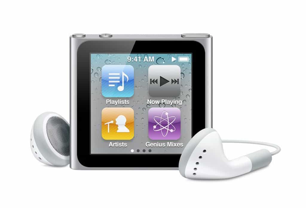
Photo: Apple
How Apple Watch could learn from iPod nano playbook
The iPod nano’s app launcher consisted of a paginated grid of 2×2 icons. Apple’s designers kept them to a manageable number by combining features like the Stopwatch and Timer into a single Clock app. Plus, Apple hid some of the less-popular apps by default. (Users could add them if they wished via Settings > Extras.)
In contrast, the App Launcher for Apple Watch remains a mess. It looks more like frog spawn, with loads of tiny icons sprawling all over the place. Plus, they’re way too small for my stubby fingers. The Apple Watch Grid View sucks so badly that Apple offered us an alternative List View in watchOS 4. (Here’s how to set up List View on your Apple Watch.)
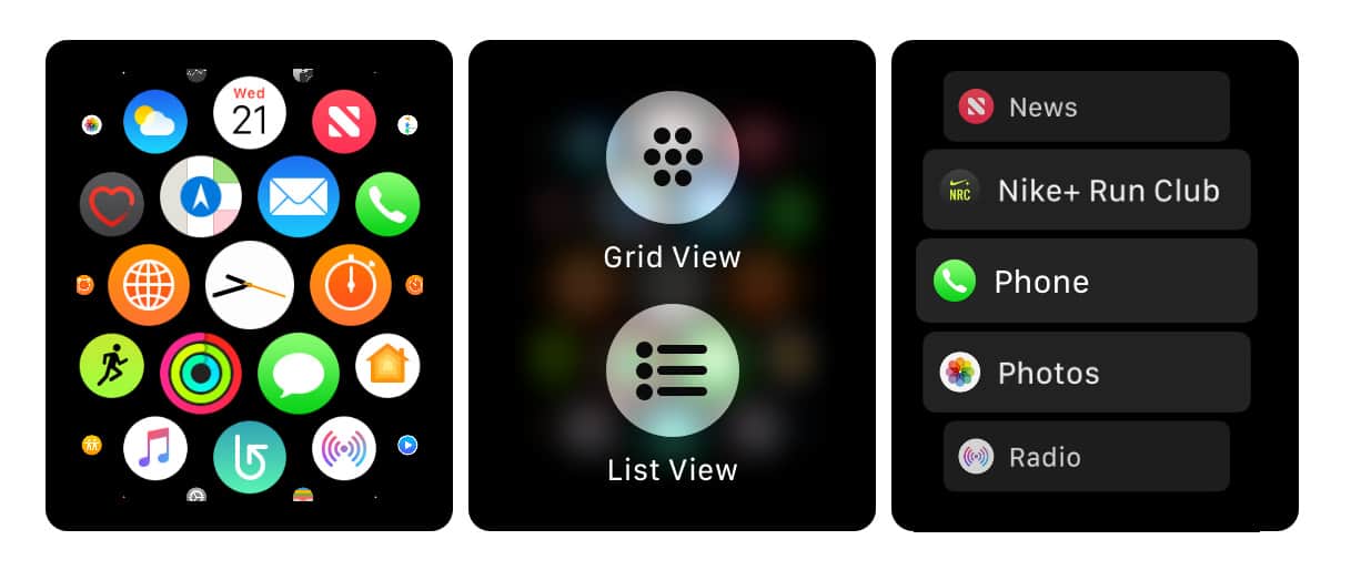
Photo: Graham Bower/Cult of Mac
List View was a tacit acknowledgment of the problem, but not a proper solution. Cupertino also attempted to make it easier to launch apps by adding two new methods: third-party complications and the Dock. Together with grid and list views, that’s four different ways to launch apps, which feels like overkill on such a tiny interface.
With a clean slate, I’d go back to the drawing board and start with the iPod nano as a reference. But it’s too late for that now. Instead, Cupertino needs to find a way to improve things that is consistent with how users have come to expect Apple Watch to work.
1. Merge the Dock and the App Launcher
The App Launcher in List View looks confusingly similar to the Dock. Both views are essentially a list of apps that you scroll through with the Digital Crown. The main difference is the Dock shows your favorites and recently used apps, whereas the App Launcher shows them all. The Dock also shows a preview tile of the app, which proved quite useful in watchOS 3. But in the vertically scrolling layout of watchOS 4, the tiles are half-obscured anyway. That renders the previews almost useless.
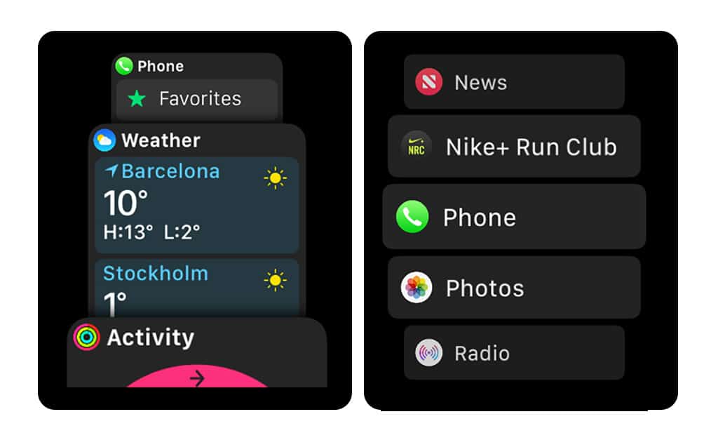
Photo: Graham Bower/Cult of Mac
The solution seems obvious: Just combine the two lists, putting favorites and frequently used apps at the top. And to make sure the list doesn’t get too long, let the user bury unwanted apps in an Extras sub-menu.
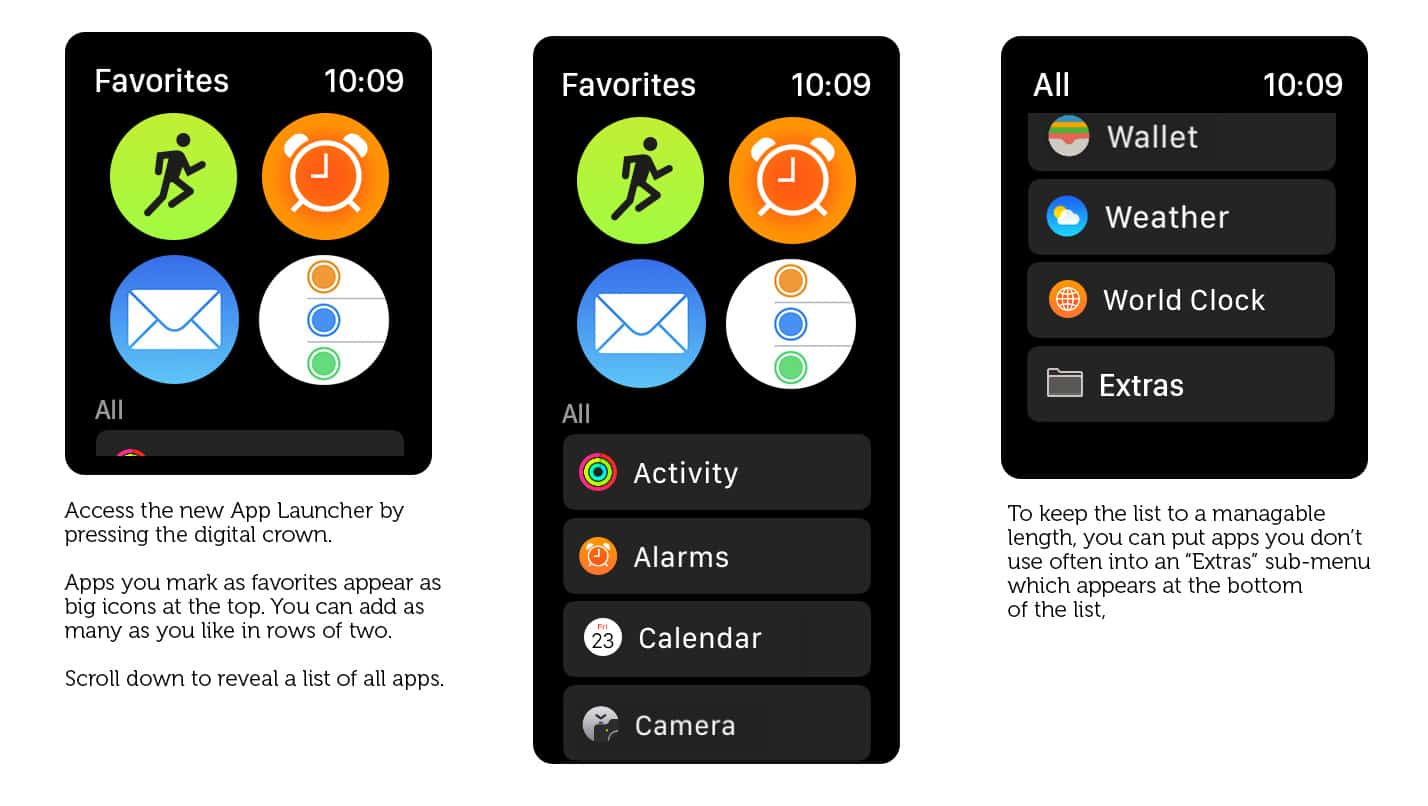
Photo: Graham Bower/Cult of Mac
2. The side button should take you back to the watch face. Always.
My biggest gripe with the Apple Watch user interface is how hard it is to get back to the watch face. That’s by far the most important screen, given that, you know, it’s a watch. You can easily access the App Launcher with a single press of the Digital Crown. But pulling up the watch face involves fiddly multiple-presses. This seems crazy.
With the Dock and App Launcher combined, the side button becomes free to do something more useful. My vote? This should simply take you back to the watch face with a single press. (A double-tap would still trigger Apple Pay.)
3. Complications are too complicated — lets have an App Launcher watch face instead
Like widgets, Complications present a small amount of data within predefined areas of the screen, and you tap on those areas to launch their respective apps. But Complications are so small, and update so infrequently, that developers struggle to come up with anything interesting to do with them.
There are currently six different types of Complications. Developers must design and produce each format individually. In practice, most devs don’t bother. Even Apple struggles to come up with interesting things to do with Complications. Check out the screen grabs of Apple’s Extra Large complications below and you’ll see what I mean.

Photo: Graham Bower/Cult of Mac
I’d like to see Apple add a new App Launcher watch face, with a 2×2 grid of icons, similar to the 6th Gen iPod nano. The user can choose which app icon to go in which space. Since this watch face would use the standard app icons, there would be no extra work required from third-party developers to support this feature.
With an App Launcher watch face, your favorite icons would always be one swipe to the right from the watch face — with nice, big, easily tappable icons.
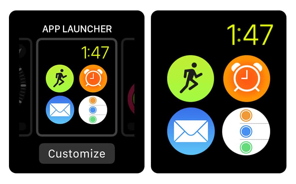
Photo: Graham Bower/Cult of Mac
4. Double-tap to unlock
Another feature I liked about the 6th Gen iPod nano was its sleep-wake button, which helped to ensure you never tap the touchscreen by accident.
While wearing my Apple Watch, I frequently launch apps by mistake. Usually this is because a Complication on the corner of the screen gets triggered accidentally.
An even worse culprit is the Digital Crown, which gets pushed every time I bend my wrist back. This means when I’m weightlifting, and perform a move like a standing military press, Siri gets triggered and asks if she can help. (Sometimes I wish she could.)
To solve this, I’d like to see Apple add an option to lock the interface when the watch is sleeping. The screen would still turn on automatically when you raise your wrist, but you’d need to unlock it before the touchscreen and buttons would work. Unlocking would need to be a very quick gesture that you’d be unlikely to trigger by accident. I think a double-tap would be ideal.
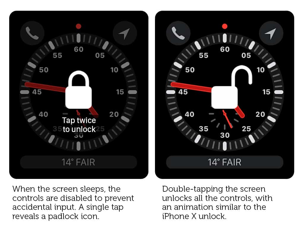
Photo: Graham Bower/Cult of Mac
5. Access Notification Center from everywhere
For most people, Notifications are one of the most important features of Apple Watch. So I find it odd that you can only access Notification Center from the watch face (which in itself is difficult to access — see point 2).
Now that I have an LTE Series 3 Apple Watch, I find it even more frustrating. During a running workout, I often glance at the screen to check if there is a red dot at the top to tell me I have unread notifications. The trouble is, this does not show up in the Workout app (even though there is plenty of space for it).
I would like Apple to add the red dot notification to the status bar, system-wide, and enable the swiping down gesture to trigger Notification Center in front of whatever app you’re in.
This could cause some confusion between the scrolling and swipe-down gesture, but I think it would be OK once you got used to it.
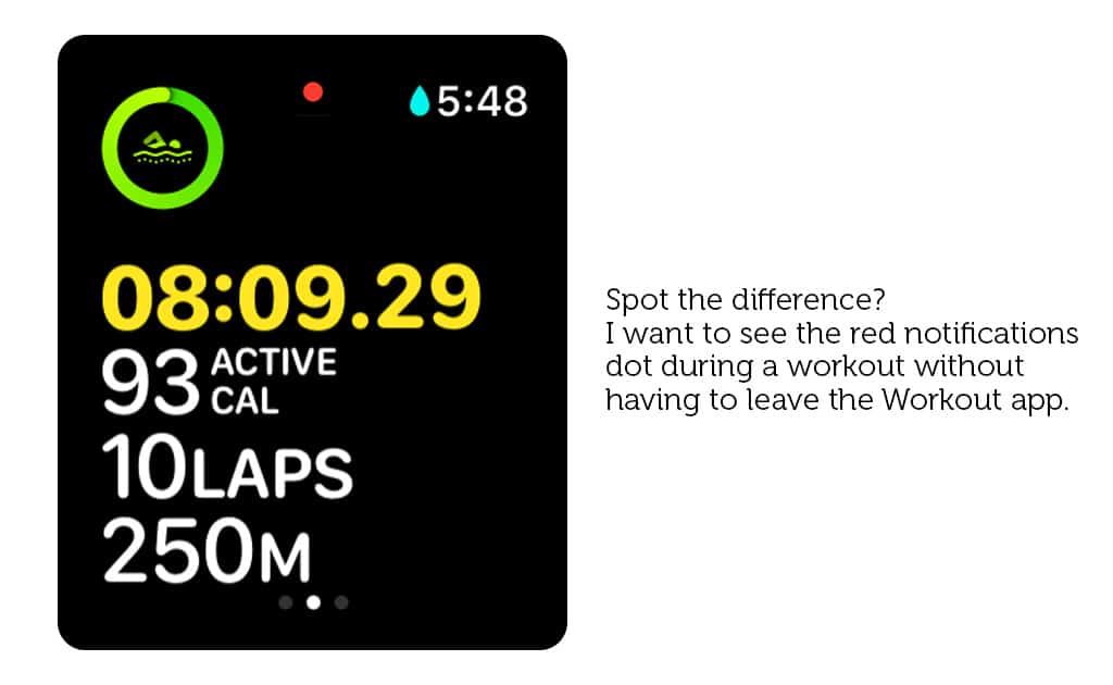
Photo: Graham Bower/Cult of Mac
6. Force apps to stop using Force Touch
Force Touch has never been very useful. It was originally developed for Apple Watch as a means to trigger context menus. That’s all Apple allows third-party developers to do with it, thanks to the limitations in WatchKit.
Apple presumably thought developers would need context menus to create mini versions of iPhone apps, with lots of controls. In practice, the few third-party apps that actually prove useful tend to be very simple, one-screen affairs. So extra controls can easily be located on a swipe to the left or right, rather than requiring an arcane Force Touch gesture that most users forget even exists.
Whether you like Force Touch or not, the reality is that no one is using it anymore. Even Apple’s own Workout app scrapped it in favor of swiping right. I think the time has come to deprecate it and encourage developers to remove it from their apps. That way, at some point in the future, it can be scrapped from the watch hardware altogether.
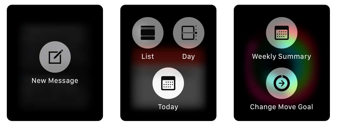
Photo: Graham Bower/Cult of Mac
7. Smart status bar
To save battery and keep things snappy, Apple limits third-party watch apps to three specific tasks they can perform in the background: workouts, turn-by-turn directions and audio recordings. To let you know when one of these tasks is active, you get a tiny icon top-center on the watch face. Tapping on the icon takes you to the app. But it’s so small that it’s hard to tap. Plus, it doesn’t tell you anything useful about what’s going on. And since it’s only visible on the watch face, you can’t see it when you are in other apps.
On iPhone, background processes like active phone calls, personal hotspots and screen recordings are indicated with a color-coded double-height status bar (or a colored lozenge on iPhone X). I think something similar would be very helpful in watchOS.
The status bar could be highlighted in green when there is an active workout in the background, with the elapsed time displayed. Audio recordings could trigger a red bar with the elapsed time. And turn-by-turn directions could mean a blue bar with the ETA display. The timer app could get a similar treatment, so you could see the timer countdown without going back into the app.
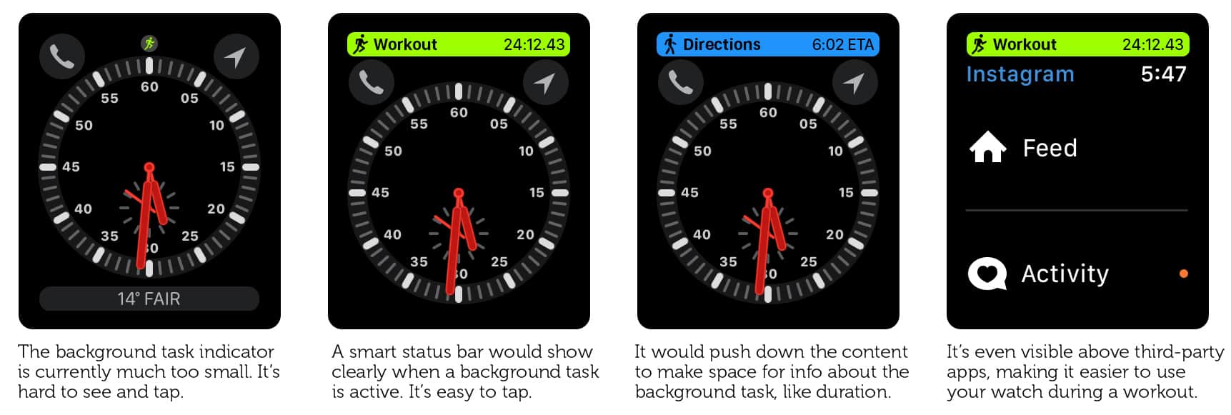
Photo: Graham Bower/Cult of Mac
How would you improve Apple Watch?
That’s it for this week. Next week, I’ll focus on the fitness experience on Apple Watch.
Got any better ideas for how Apple should improve watchOS? Let us know in the comments below.
![The watchOS improvements I want to see at WWDC [Mockups] How Apple could give watchOS a tune-up](https://www.cultofmac.com/wp-content/uploads/2018/03/retooling-applewatch.jpg)
