Apple’s Boylston Street Store: Before and After
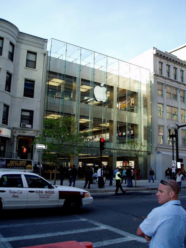
Here’s the striking glass facade of Apple’s new megastore on Boston’s Boylston Street. The store opens later today (See IFOApplestore’s coverage of the overnight campout), but is being criticised for not blending with surrounding buildings.
But check the picture below, which shows the lot before Apple. Which do you prefer?


In first place, the surrounding buildings are nothing special. Second, it integrates perfectly.
bonzo, on May 15th, 2008 at 6:45 am
A window washer’s delight or a window washer’s nightmare. It does look a heck of a sight better than the store before it. I sure hope the people in Boston love Apple and Mac products.
Constable Odo, on May 15th, 2008 at 7:15 am
The old building looked like it belonged with the others around it, the new one looks like a parking garage with an expensive glass facade. At least the new one is at least on a scale with the buildings around it.
Danny, on May 15th, 2008 at 7:39 am
You can check out this shot, as well, for a wider-angle perspective on the pre-Apple appearance:
http://prwdot.org/gallery2/v/events/2006/boston_may_7/P1080921.JPG.html
Peter R. Wood, on May 15th, 2008 at 7:47 am
I agree with Danny — it would have been interesting if Apple had tried to stay consistent with the surrounding architecture.
C Rolls, on May 15th, 2008 at 8:51 am
I don’t know. Boston in general is too stuck in it’s late 19th century architecture, and especially Back Bay. I think it’s refreshing to see something modern and exciting in this town. Plus what you don’t see is what’s across the street, which isn’t much to look at - a mall and the one of end of the convention center.
cambridge rocks, on May 15th, 2008 at 9:52 am
This glass-house looks like it should be growing tomatoes rather than selling Apples.
Where is the parking?
RON, on May 15th, 2008 at 12:05 pm
See: http://www.boston.com/news/globe/magazine/articles/2007/02/11/stained_glass/
“Ironically, it is perhaps because Boston is so blessed with a rich architectural history that we cannot see beyond it. We often let our beloved brick buildings define us completely – whereas in European cities with architectural histories much longer and richer than ours (Berlin comes to mind), daring contemporary designs create a dynamic panoply of style.”
===
It’s fashionable to lament the new intruding on the old- but this can be very short-sighted, too.
JoeP, on May 15th, 2008 at 12:12 pm
Echo “cambridge rocks” comment… Across the street is a very different scale and architecture. Without that context it’s hard to judge how well the new building fits in its surroundings. And, yes, Boston definitely needs to loosen its collective collar - quite a bit. The previous building on the site may have shared details and materials with its neighbors, but the scale of the Apple store is much more appropriate to the site. And there’s something to be said for the increased foot traffic and activity the building brings to that stretch of the street.
CaveDog, on May 15th, 2008 at 12:13 pm
As to this building clashing with historical architecture; I’m sure SuperCuts and Sir Speedy are bummed it shows ‘em up! Then again, they won’t be sad about all the extra foot traffic coming their way.
Artisticulated, on May 15th, 2008 at 1:16 pm
Both of the adjacent buildings are butt-ugly, and neither is architecturally compatible with the other. Plus, the now-gone middle building was incongruous with both its neighbors. The Apple building unites the block physically by filling in the big cavity that was so obvious before, it mediates the space between the two older, more tired buildings, and it actually makes them look less boring and pedestrian. The real problem is that the neighboring buildings look dowdy, inferior, and out of date. No amount of help from the Apple Store’s redeeming facade will remedy that.
filect13, on May 15th, 2008 at 4:38 pm
Apple building looks awesome.
Partners in Grime, on May 15th, 2008 at 8:46 pm
JoeP -
The reason the buildngs in Berlin - and other German cities - has such a “panoply” of styles is because the entire city was bombed flat. Same for most of Munich, Dresden, and others, as well as Austria.
I’ve been to Berlin. This panoply of buildings all look like they were “cutting edge” back in 1955. Most are now tired, ugly boxes. And Salzburg (Austria) is a hoot. They have all these buildings (most in the “Maria-Theresa” yellow style) with 18th Century plaques on them. Except they were also flattened in WWII and then “restored.” I was there in 1997, and they were “restoring” Mozart’s birthplace. I looked through the construction wall opening and saw… a hole in the ground.
London does a great job mixing old and new. Most projects maintain the original facade, and then gut everything and build up. So an old 4-story Victorian becomes a 12-story modern office, but with an 8-story complementary modern facade at the top.
imajoebob, on May 17th, 2008 at 12:39 pm
[I hope this isn’t a duplicate - the first try never showed up]
Danny said exactly what I was thinking: a parking garage. All they had to do was make the stone facade a bit more decorative, as if they opened up an original building and added the glass. This looks like Apple style meets Soviet architecture.
It’s not that hard. Look at the London store (Regent Street).
http://images.apple.com/uk/retail/images/overview_hero_regentstreet.jpg
imajoebob, on May 17th, 2008 at 12:42 pm
very impressive design amazing glass stairway and facade BUT THIS WILL BE AN BEAR TO HEAT AND COOL NO INSULATION, NOT AT ALL GREEN.
fp, on May 17th, 2008 at 2:37 pm
I live in Boston…that store dresses the street up! Looks great
Vic, on May 21st, 2008 at 8:27 pm