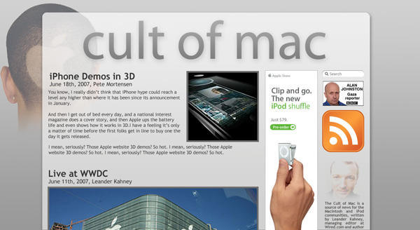
We’re trying out a new “beta” redesign here at Cult of Mac by the genius graphic designer Rob Beschizza, who is also a Wired News contributo.
The site may be slow for a few days and there may be glitches. Please us know if there’s any problems in the comments below. Please also leave your general feedback.
– Graphics are not final; big files might make for longer download
times or poor performance on slow machines.
– Beware general oddness; there’s some rough, invalid markup, etc.
– Transparent PNGs will look messed up on IE6. Upgrade! But IE6
detection is coming.


41 responses to “Cult of Mac Redesign”
Ummmm…. really bad timing. You should do this next week or later.
Ooh, I like it!
Ooh, I like it!
Quick tip – just follow the process here for PNG rendering in IE5 + 6:
http://homepage.ntlworld.com/b…
This is the same technique Apple.com uses in the iPhone Gallery (which also uses PNGs and works fine in IE).
I get a doubled copyright notice at the bottom of the page. But other than that I like it.
And (not to double post, but I just noticed it), the bottom banner ad is offset to the right. I’m running Safari 3.0b, btw.
I find that when I try to use the RSS feature within Safari it doesn’t work saying that the page can’t be displayed, This may be that you aren’t using RSS or don’t have it setup, but if you do, and it should work, it’s not… Just wanted to pass it along… Love the site!
Brian
Nice.
Beautiful design! By the way… Are your books going to be translated into spanish any time?
Big fan of the new design, great job so far.
Obviously didn’t design it to a mainstream resolution. View the site at 1024×768.
Woody,
It should be fine at that res, but I do want to tighten it in a bit. I’ll be tweaking and editing a lot in the coming days to work out browser-specific bugs – the main layout should just fit in a 1024x window, and once done, there’ll be space to spare.
re-work… not very attractive…
I like it, nice & readable.
But I preferred the old logo (on Wired) ;-)
The new layout is terrible. Poor colors make the site seem dull and uninteresting. Low contrast between text and background color make it hard to read. Header image is WAY too large consuming almost a good 1/3 of the screen for most popular resolutions. In sum: redesign or let’s go back to the original layout! Please! Thank you!
Ugly!!!! Fire your designer (and hire me).
Dougie, thanks for the link to Apple’s favored PNG transparency fix. I’d planned to use a different technique (server-side instead of javascript), but that will do just as well!
Howie, the colors will be tweaked, with an eye to a better contrast.
“*#&!)(#@,” anything in particular you don’t like?
Bde, thanks for pointing out the footer bugs :-)
Howie, the colors will be tweaked, with an eye to a better contrast.
“*#&!)(#@,” anything in particular you don’t like?
Bde, thanks for pointing out the footer bugs :-)
Looks great, i just came across the new desing, melikes!
I don’t think the problem is with the colors… mainly the gigantic size of you logo header and the layout.
great content as usual…