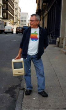
In a nice little piece of Internet archeology, an interview with graphic designer Rob Janoff on the creation of the iconic Apple rainbow logo has resurfaced at zlok.net.
In 1976, Janoff worked as an art director for Regis McKenna where he created the logo, it was a pro-bono gig.
“For inspiration, the first thing I did was go to the supermarket, buy a bag of apples and slice them up. I just stared at the wedges for hours,” recalls Janoff. The fruit of his labor: a simple 2-D monochromatic apple, with a healthy bite taken from the right side. Jobs loved the conceit-only he suggested it be more colorful. Janoff’s boss disagreed, insisting the logo be made all black to save on printing costs.
“But Jobs was resolute, arguing that color was the key to humanizing the company,” says Janoff. “So I just put colors where I thought they should be, not even thinking about a prism.” What thanks did Janoff, now the owner of his own Chicago-based graphic design firm, get for all his hard work? “Not even a holiday card.”
Full article here.
Janoff’s site also has a nice radio interview with him talking about his “eureka” moment as he made the logo…


