Up next in 10


Article on Cult of Mac:
@s-26-beta-features-changes
More Apple news: @
#iOS26 beta 3 tweaks the #LiquidGlass #design making the UI elements frosty to improve readability while making multiple smaller changes.
Follow us!
Threads: https://www.threads.net/@cultofmac
Mastodon: https://mastodon.social/@cultofmac
Instagram: https://instagram.com/cultofmac/
X: https://x.com/cultofmac
Facebook: https://www.facebook.com/cultofmac
Show More Show Less View Video Transcript
0:00
[Music]
0:01
Let's uh talk about uh everything new in
0:03
the iOS 26 beta 3, which actually makes
0:07
a really pretty big ch quite quite
0:09
hilarious change. I think
0:11
I think we'll maybe I I feel like we're
0:12
going to have a lot to say about that.
0:13
So, maybe I'll I'll save that one to the
0:15
end. But, uh quick rundown of changes in
0:17
the third beta. It's been another two
0:19
weeks, so thank God we're It's a little
0:21
less buggy this time. I'll say that. Um,
0:24
iOS 26 beta 3 makes the colors of
0:28
control center toggles a little
0:29
brighter. It's a brighter shade of blue.
0:31
Um, this is a fun one. So on Mac OS, I
0:35
think ever since Yusede, you've been
0:37
able to shake the mouse cursor and make
0:39
it really big so you can easily find it.
0:41
That's now on the iPad. Now that you
0:43
have the free form Mac like windowing on
0:44
the iPad, you can shake your cursor.
0:46
It'll grow really huge. That's actually
0:49
a very very understated uh
0:51
underappreciated uh u uh feature, you
0:53
know, like it's super handy. I do it all
0:55
the time.
0:56
Uh the Safari menu that shows your
0:58
bookmarks, reading list, history is much
1:00
bigger than before. It now fills up the
1:03
entire screen, whereas before it was
1:04
kind of like half height, and it has
1:06
this uh recently saved section on top
1:08
that shows you the recent bookmarks and
1:10
items you've added to your reading list.
1:12
I've heard a lot of people disliking
1:14
this. I I'm kind of ambivalent about it.
1:16
Uh, this is a change that I'm not happy
1:18
about, though. Now, when you enter
1:20
multitasking mode, what you're used to
1:22
seeing is, you know, the app that you're
1:24
currently using nudges over to the right
1:26
so that you, the first thing that you
1:28
can tap is the second most recent app.
1:30
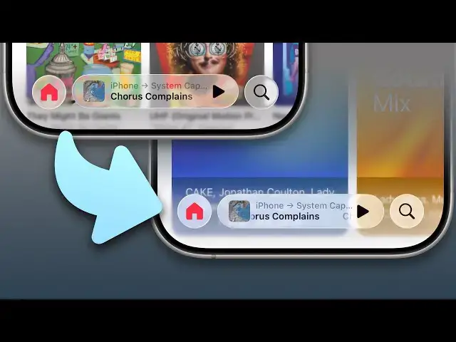
But now it doesn't do that anymore. You
1:32
swipe up and it just stays there and you
1:35
then have to swipe over to the next app
1:36
if you want to use the next app,
1:38
which is an interesting change. Um, I
1:41
don't know if it's a bug or whatever,
1:42
but
1:43
okay. I haven't downloaded it yet, so I
1:44
haven't had a chance to uh to play
1:45
around with it.
1:46
Yeah, they've also added more color
1:48
options to the new iOS 26 wallpaper.
1:50
They keep making changes to that uh with
1:52
every beta. But the big one is that it
1:56
significantly tones down the
1:58
transparency in liquid glass, making the
2:00
elements more frosted, a little more
2:03
opaque, that improves readability, which
2:05
was a common complaint that we've, you
2:07
know, had on heard on this very show.
2:09
But it does make the liquid glass
2:12
effect, like the glassiness of it much
2:15
less flashy and much less uh I think
2:18
dramatic and in my opinion much less
2:20
cool looking.
2:22
I' I've always been on board with liquid
2:23
glass since the you know since it was
2:26
unveiled. I've always thought it was a
2:27
neat look. Honestly, like my biggest
2:28
complaint with Tahoe, putting aside all
2:31
the user interface regressions is the
2:33
fact that it isn't more liquid glassy.
2:36
It's, you know, a slightly different
2:38
transparency effect, but it's not
2:40
animated like it is on iOS. But yeah,
2:42
it's it's much more opaque. Maybe maybe
2:44
Apple has is going to continue to tweak
2:46
the translucency with every beta and
2:48
they're going to find a nice happy
2:49
medium. But
2:50
yeah. Yeah, it's funny, isn't it? When
2:52
it first came out, it was like every the
2:53
whole internet lost its mind. Oh my god,
2:54
that's completely unreadable. So, and
2:57
now they made it, you know, frosted
2:58
glass and now everyone's going the
3:00
opposite way. They're all freaking out
3:01
like, you know, what happened to liquid
3:02
glass? Now they've ruined it. Now it's
3:04
just like, you know, it's it's uh it
3:07
looks like a bad sort of Windows Vista
3:09
implement implementation.
3:11
From the developer end, Apple has
3:13
bifurcated it. Like they made the
3:14
default liquid glass style a little more
3:16
opaque, but then they added like, you
3:18
know, if you're using Swift UI, you can
3:20
use like a clear glass style that'll
3:22
make it more like the first two betas.
3:24
And I think what Apple is going with it
3:27
is that uh you know buttons and things
3:29
that don't have text and like just
3:31
symbols if you have like a symbol like
3:33
on a button floating over your content
3:35
then you can use the clear glass style
3:36
there and you'll get more of the you
3:38
know visual warping effect behind it.
3:41
But if you have text like in the Safari
3:44
address bar or the bottom tab bar in
3:46
music or podcasts then it'll use the
3:48
more frosted style so that you can read
3:50
the text easier. I mean, personally, I
3:53
didn't have a problem reading the text
3:54
in the first two betas, but I'm also the
3:56
youngest person.
3:56
Me neither. Me neither. You know, it's
3:58
if you looked at the the screenshots of
4:00
the on X and and uh a screenshot, yeah,
4:03
it it could be hard to make out, but
4:06
when you're using it, when it's dynamic,
4:07
when it's moving, I've had no problem at
4:09
all. I don't have any any legibility
4:11
problem
4:11
because when it's in motion, you see the
4:12
warping behind it, and you can it's it's
4:14
easier for your brain to separate, you
4:16
know, the the background from the text
4:18
on top of it,
4:19
right? I I thought it I thought it was a
4:21
hot mess. I mean, I it's really
4:24
interesting to hear you you two say
4:25
that, but uh
4:27
uh you know, I I there were many
4:30
instances where I saw things where there
4:31
was serious like legibility problems. I
4:33
encountered those all the time. And uh
4:37
but I would say I'm I'm sad about this
4:39
because the normal liquid glass state
4:41
now being more frosty, yeah, you you you
4:43
lose the liquid glass effect almost
4:45
altogether, I think. So, it sort of goes
4:48
back to the more diffusion look that we
4:50
had before, the lensing effect. You can
4:51
hardly see because it's so frosty. So,
4:54
um I I do think that's a shame. I think
4:57
it's a shame what we've lost. But, uh at
4:59
the same time, I don't know what else
5:01
Apple could have done. And then with the
5:03
normal and the the clear modes of liquid
5:05
glass, Griffin, that you were touching
5:06
on uh in the developer sessions, they're
5:10
kind of really explicit that you're
5:11
you're kind of not allowed to use the
5:13
clear mode for almost anything apart
5:16
from the example that you gave of of
5:17
like if it's a media player, you might
5:19
use it for uh uh the media controls in
5:22
the middle of the screen, but even then
5:24
you need to put a dimming layer behind
5:25
it. I mean the the thing is like Apple
5:28
has been designing this, you know,
5:30
allegedly they say they've been
5:31
designing this for years.
5:34
Why didn't they encounter this? Did they
5:36
did no none of the designers ever think
5:38
to put like a you at least try and see
5:41
how it looks when you put have it on
5:43
like a garish color background and then
5:45
oh you can't read the text as well. Oh
5:47
like they didn't realize that until they
5:49
shipped the thing. I suspect they had
5:51
conversations internally just like the
5:52
one that we've had that they there was a
5:55
different views. Some people were saying
5:56
this is a hot mess and other people were
5:58
saying I have no problem with it.
5:59
Everyone agreed it looked more cool when
6:01
it was less frosty.
6:02
So they maybe thought let's put it out
6:04
there and see if we get away with it.
6:07
Yeah.
6:07
Well, that this that is the whole point
6:08
of a beta, isn't it really? I mean, it's
6:10
it's to, you know, see test this out in
6:11
the real world, see how it how it lands.
6:13
Yeah.
6:13
And I think you're right. It's going to
6:14
it's probably going to like seessaw from
6:17
one extreme to another until we end up
6:19
with some kind of happy medium in at the
6:21
end.
6:22
It's frustrating that they that they
6:23
showed us the super cool looking version
6:25
only for four weeks and then oh no, we
6:27
can't have that anymore,
6:28
right? And now
6:29
well then why did you make it if you
6:30
weren't going to ship it?
6:31
Well, I I do love that lensing effect
6:33
and so if I I really hope they can find
6:35
a way to show the lensing off a bit more
6:39
whilst still having it a little bit
6:40
little bit more frosty. Yeah, it'll be
6:42
interesting to see. Interesting to see
6:43
how they how they play this one out.